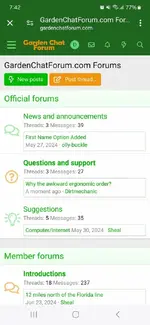
Why the awkward ergonomic order?

Dirtmechanic

Active member
Hardiness zone
8a
When I log in I intially see a mechanics view of a car dealership. Very practical but I feel empathatically for a first time site user. Oddly mechanical pages such as this sub being first listed seem confusing by being offered first before more thematic subjects. My suggestion is convert that initial page to something more like a "what is new" experience.

Currently on mobile one must manually discover that scrolling down arrives at the desired location for subject matter or at least topical postings the vegetabley challenged mind might have stumbled upon via google or other pathways.

Were an alien to magically arrive through a wormhole and suddenly be handed a cell phone where they might look up the only plant that supports their species on this site (koala bears from space?) and @Tetters had mentioned eucalyptus trees, then the placental structure that started the site might be better modified in that light that supports magical space traveling teddy bears in rapidly finding their dinner- if it were a thread.
 
Last edited:
I'm not sure I'm following. Are you wanting me to move the "Official forum" section to the bottom of the forum listing page? At least that's what I'm gathering. If so, that's doable for sure.
 
I'm not sure I'm following. Are you wanting me to move the "Official forum" section to the bottom of the forum listing page? At least that's what I'm gathering. If so, that's doable for sure.

The page feed sequencing model structure (whatever it is called) that was used to start the site seems to have arrived at a another more mature stage.

As the thread count has grown, the pages change in appearance becoming taller, driving any new arrival to scroll down, something which is not obvious at first. New folk will get disoriented by a site structure.

At least in my case on this phone I get non gardening topics first. It strikes me as akin to walking into the kitchen of a nice resturant instead of the front door. Presentation is my point. Its nice to know where the bathroom is but usually its not what a customer is first met with though they might like a sign somewhere such that they might find it themselves or something like a site service desk.

Eventually the monetization of the site will require tweaking pages and code for whatever searchbot reasons.I am looking down that road. When that user comes in what should they see?

Screenshot_20240706_074238_Chrome.jpg

So the Forums page is a high ranking Menu item. Perhaps the idea of separation, a second menu button for example, where when one goes to the forums and sees forums not the office. Maybe the structure might be clarified by narrowing the definition of the word forum. Technically every level the site is a forum including the domain name. Too broad a definition leads to overuse and less than clear structure.

My expection of "Forum" has a public theme. A stickied introduce yourself page. Member and Office functions need not be as forward. Minor points but dont confuse the little green koala bears right?
 
Last edited:
Well all that seems like double dutch to me I'm afraid, but then I don't use a smart phone - primarily because I don't really think those things are really that smart, however, I am trying to understand what you're on about Dirt, and have asked Zigs if he can decipher for me.
 
I see what you mean Mr Mechanic :eek:

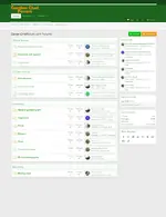
Not something I've got the tools for but maybe moving the Gardening block above the other blocks would help. Something that maybe Mike could have a look at :)

I tried playing around with the magnification but that wouldn't help if you were viewing on a phone so something needs to be at the top.

Screenshot 2024-07-06 225913.webp
 
I see what you mean Mr Mechanic :eek:

Not something I've got the tools for but maybe moving the Gardening block above the other blocks would help. Something that maybe Mike could have a look at :)

I tried playing around with the magnification but that wouldn't help if you were viewing on a phone so something needs to be at the top.

View attachment 791
Well that ports into a demographic really, number of users on cell vs pc vs tablet. Lowest common denominator is problematic when one screen is wide annd the other tall.
 
@Dirtmechanic I suggest when you get over your hangover, you try to express what you want to tell us in small English words - preferably in the right order 😌
@Mike, all you need is to keep a salt pot nearby so that you can use a big pinch of it whenever necessary 😉 1720348366363.webp
 
... express what you want to tell us in small English words - preferably in the right order 😌
I'm still marveling at the use of "Placental structure?? in the context of "placental structure that started the site might be better modified in that light that supports magical space traveling teddy bears in rapidly finding their dinner"

That would be some English words, presumably in the intended order, never before seen or read. :)
 
Well as someone who has personally given google adwords $40,000 on an ongoing annual basis for advertising forgive my fun at your expense. I saw-see a roadblock in site development relative to monetization which requires higher usage patterns. I also prefer to define an idea by using any means necessary to avoid using the words being defined. Thats just my fun really as it should be easy.

Fortunately they require multiple sizes in the ads you pre-upload such that when the financial trigger word is pulled the ad size does not cause a code conflict and fail to load on the user screen this delivering $ value to this site. Flexibility requires different ad shapes for example as discussed above.

The behemoth is mainly Google. But the other engines too like Microsoft's Bing and the Yahoo are only the backs of the financial flows upon which site money will ride.

Something I did not mention was a youtube channel for the site where every vid gets posted, and vids of pictures can get posted as well. But that could only be derived from not running off newcomers via a confusing inititial (or placental) experience since so many sites have basically commoditized the logical structure of their pages which actually serves as a proofing ground or training ground in what a user is to expect. Such that site design that maligns the common experience logic is also a site that is abandoned and can be measured based on page dwell time reports.
 
Last edited:
I'm still marveling at the use of "Placental structure?? in the context of "placental structure that started the site might be better modified in that light that supports magical space traveling teddy bears in rapidly finding their dinner"

That would be some English words, presumably in the intended order, never before seen or read. :)
I was in a group of one hundred businessmen that ate lunch on Tuesday. It was started during the Great Depression. Not a person there disagreed with the idea that "Nobody knows how to start a business but everybody knows how to run one".

And since you are without doubt the Senior scientist here I want to point out that I am only synthesizing ideas with a newly created word which not being a new idea is not worthy of your pHD level thesis. I muck around the bottom levels in that regard. Everytime I have a new Idea google proves it was not really.
 
Last edited:
@Mike the search words for each page?

By becoming more narrow it becomes faster in some ways. Have you ever gone to a site page via google adwords and seen the list of search words used by that page? If not pm me.

If you have, then describing flora has this latin"y" formal structure and casual descriptions are also in play. Which way to go?

I know a bit about what you're talking about but, unfortunately, I don't have much control over the descriptions used on individual pages on the site. Typically the description is made up of the first X number of characters/words of the first post in the thread. That's fairly consistent amongst most forum software. One exception is if "tags" are enabled, and folks are making use of those tags. In my experience, though, they're rarely used and rarely are representative of the overall site content, so I just leave them disabled across all my sites.

Also, search words aren't really anything I have control over for most pages either. That's largely up to the folks who are replying to the individual threads.

All this said, Google is starting to pick up the pages and put them into the search results now. It's taking longer than I'd like to move up in the results, but our impressions and clicks are going up, albeit very slowly.
 
Back
Top